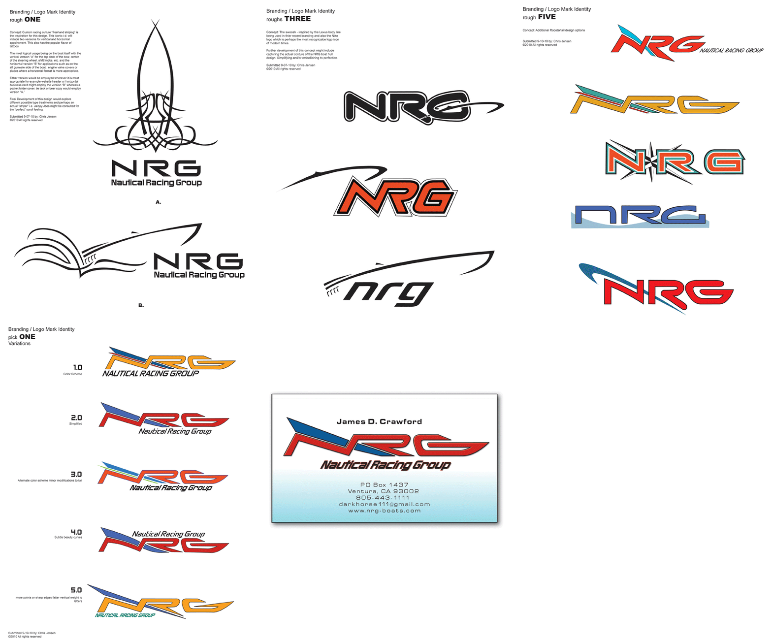
Logo Design: The most integral element of your brand. Simplicity is key. A logo should convey as much information about the entity it represents with as few elements as possible. A well designed logo should read well in full color on a billboard or in a very small foil stamp on the side of a pen or pencil. You can pack a lot of perceived information into a logo design. Your logo should effectively define your brand with a glance, be memorable, establish color schemes and explain the dynamics of your product or company. It matters little if I'm designing a logo for a giant corporation or Joe the florist down the street, in order to create a successful mark the same process must take place. I often start with a pen and paper scribbling down the first things that come to mind. I ask myself many questions about the essence of the message for the product person or company that the logo will represent. I start as far outside the box as possible and work my way back in. The client will never see my drawings or even 90% of my ideas. I want to present the best 2 or three. A logo should be provided with a plan of protocol to ensure consistency including PMS ink colors and Process Color matches, size relativity to medium space. With more deluxe logo design packages I will also offer an animated version for web or TV. CASE STUDY - NRG Racing Boats Job Description: Entrepreneur Jim Crawford spends a good part of the year in a small town with a lake in Missouri. Jim was enamored with a sleek boat he saw cruising the lake. He asked around and found that the company that made the boat was right there in town...and they were struggling so rather than buy the boat he bought the whole damn business...that's how Jim rolls. Branding / Logo Mark Identity Logo design process for CAPS TV6
|
|
E-mail Chris Jensen * Tel 805/653.6731 * Left Coast, USA
©Chris Jensen 2014 * All images herein are copyright protected, are not public domain, and may not be copied without permission

