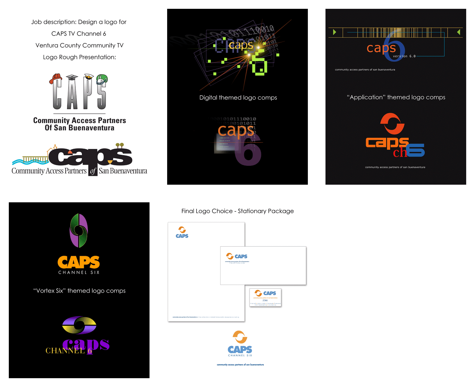
Logo Design: The most integral element of your brand. Simplicity is key. A logo should convey as much information about the entity it represents with as few elements as possible. A well designed logo should read well in full color on a billboard or in a very small foil stamp on the side of a pen or pencil. You can pack a lot of perceived information into a logo design. Your logo should effectively define your brand with a glance, be memorable, establish color schemes and explain the dynamics of your product or company. It matters little if I'm designing a logo for a giant corporation or Joe the florist down the street, in order to create a successful mark the same process must take place. I often start with a pen and paper scribbling down the first things that come to mind. I ask myself many questions about the essence of the message for the product person or company that the logo will represent. I start as far outside the box as possible and work my way back in. The client will never see my drawings or even 90% of my ideas. I want to present the best 2 or three. A logo should be provided with a plan of protocol to ensure consistency including PMS ink colors and Process Color matches, size relativity to medium space. With more deluxe logo design packages I will also offer an animated version for web or TV. CASE STUDY - CAPS Channel 6 - Community TV Branding / Logo Mark Identity Logo design process for NRG Racing Boats
|
|
E-mail Chris Jensen * Tel 805/653.6731 * Left Coast, USA
©Chris Jensen 2014 * All images herein are copyright protected, are not public domain, and may not be copied without permission

